eCommerce for Solar
Designing a personalized, educational, eCommerce experience to introduce customers to home solar.

Role
User research
Interaction design
Client
Residential solar
energy company
Duration
August 2021 - December 2021 (4 months)
Designing a personalized, educational, eCommerce experience to introduce customers to home solar.
User research
Interaction design
Residential solar
energy company
August 2021 - December 2021 (4 months)
In 2021, a residential solar company set a goal to expand and serve 1 million customers across the United States. The company’s current customer acquisition channels relied heavily on salespeople to generate leads, a costly process that hurt margins. Accenture/Fjord was engaged to envision and develop a best in industry customer experience to accelerate digital sales.
Going through multiple rounds of design, research, and iteration, I owned the effort to develop a responsive web experience that was feasible for the dev team to build within 4 months. The experience was slated to be released in South Carolina, a pilot market with minimal conflict to the company’s other customer acquisition channels. Our single paged MVP matched the company's current conversion rate for their entire website.
Users stepped through a linear experience with 4 different sections, each accomplishing a different goal.
The purpose of the landing page is to teach the customer about the company and value proposition of solar.
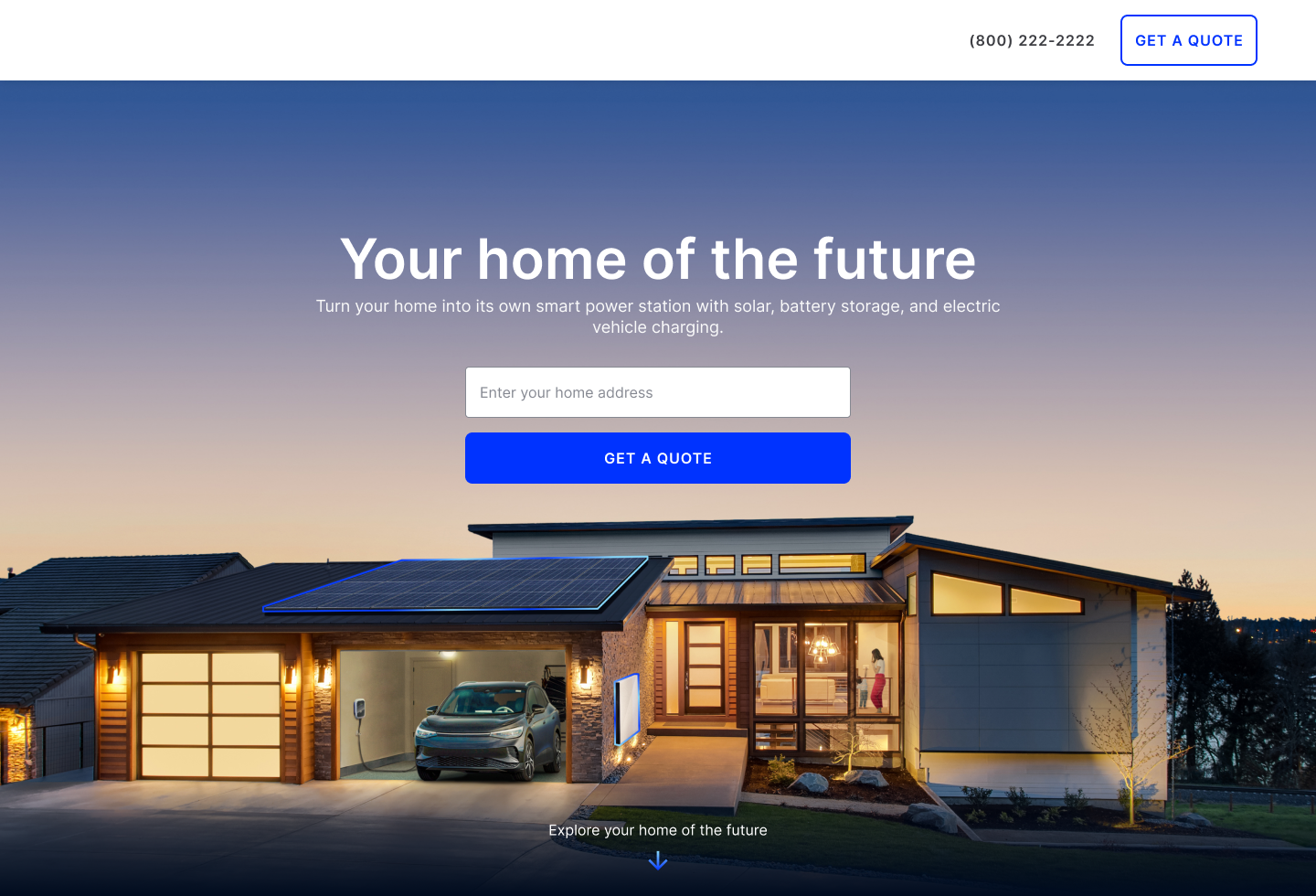
The next part of the flow qualifies the customer and understand their home energy needs.

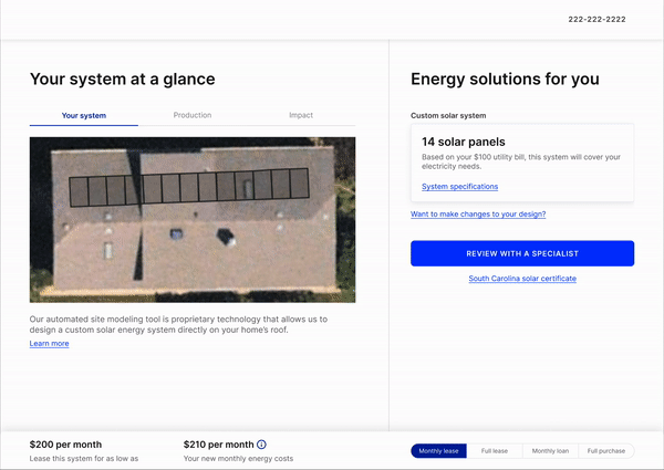
Then, we present the customer with home energy solutions, while offering tools and resources to educate them.
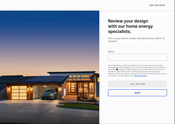
Finally, the customer is guided to a sales representative who can complete the process.
Early in the project, I planned and conducted stakeholder interviews to get to know the company and better understand the landscape of home energy solutions. We talked to individuals with years of experience in the solar industry, as well as members of the tech and sales teams. Here were our key insights.
“Educating the customer is a big part of the sales rep’s responsibility” - Company executive sponsor
“Company is not the cheapest option ... we beat out other competitiors for financing method and service package bundling” - Company UX designer
In the current sales process, the post transaction experience has a lot of friction. Customers report poor NPS scores due to transparency of the process after putting down a deposit.
“PTO (permission to operate) takes 2-3 months. Customers work with a direct project coordinator during this time. But this timeline is not provided upfront, so customers are unsatisfied.”
- Marketing director
We conducted a competitive analysis of analogous/adjacent experiences. We looked into companies like Tesla, Subaru, Zillow, Zales, and more.
Many of our competitors had nice configurator features that we were hoping to incorporate into our design including: real-time preview of product, comparison between products, preselected packages to be adjusted later, imagery/education, and on demand support.
The stakeholder interviews and competitive analysis helped us define design principles to keep in mind when we were creating wireframes and comps.
We want to be transparent about pricing and set expectations so customer’s know what is happening at every step of the process.
We will offer the right amount of help at the right time and communicate in easy to understand language.
The experience will be interactive, dynamic, and engaging.
We strive to make the experience relevant to the specific needs of our customers.
We sketched various ideas and concepts for what our solar eCommerce experience could look like. After multiple rounds of feedback from our stakeholders, we settled on a journey to follow. From there, we were ready to begin putting together wireframes for development.
As we built out sections of our experience, I created a service blueprint to help us understand the backend integrations that we had to consider. This ultimately helped us identify requirements and understand what was feasible to build within our tight timeline.
While the blueprint wasn’t a named deliverable, it served as a good exercise for onboarding team members to quickly understand the domain.

To build my designs, I started gathering business requirements and understanding customer needs for each section of the flow. The early sketches helped us to progress conversations between our business/product stakeholders and give them something to react to. Once we had more formal constraints, I built wireframes to outline the content and interactions within the experience.
With our rough wires, I prototyped together the sections of the flow. It was time to test different assumptions that we had made in our designs. I created an interview protocol to conduct usability testing with real customers. Together with a design researcher who helped me to recruit participants, I facilitated tests of the prototype with participants, synthesized our findings, and implemented changes.
In parallel to my interaction design efforts, a visual designer was working to build out a design system for us to quickly turn our wires into comps. After they built out some key screens and laid the foundation for visual design (type styles, color, branding, etc) I was able to pick up and turn my wires into comps. I annotated our screens to guide development and delivered them through a tool called Zeplin.
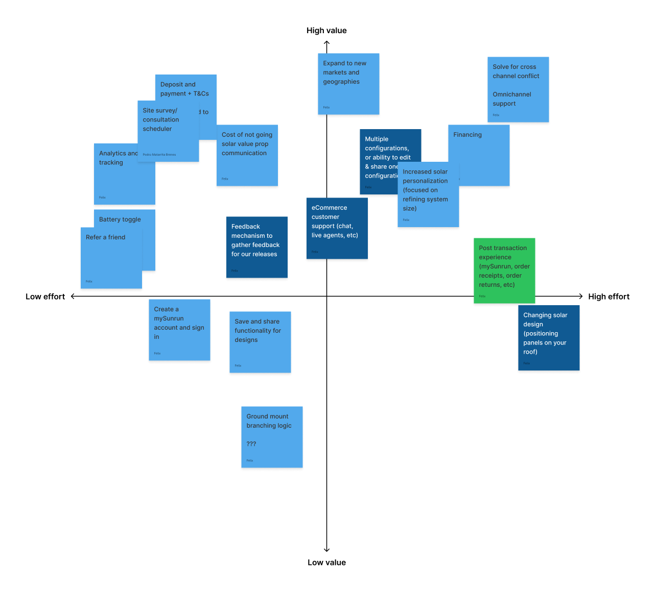
To help the business plan for a future release, I collaborated with developers to plot new features along an effort and value matrix. This matrix was presented to our business stakeholder to guide decisions on our next release.
We were unable to add polishing touches to our early designs due to short timelines and development constraints. However, after delivery, I was able to spend additional time exploring motion and animation. Click here for a video showcasing the sizzle!
To add to AB testing already done on the platform, I would work closely with data scientists to set up data tracking so we are able to better understand customer behavior on our website once we release.
I would use Google's HEART metrics framework and the AARRR pirate framework to define metrics to track the efficacy of my designs.